
INTRO
Africa has a mobility financing gap that no one has cleanly solved.
Fleet operators and individual drivers need vehicles to generate income.
Capital providers and micro-investors want to fund those vehicles and earn returns. The two groups need each other — but the systems connecting them are opaque, exploitative, and slow.
Blockride's thesis was simple: put the financing on-chain. Transparent repayments. Traceable capital. Blockchain-backed accountability for both sides of the transaction.
As the founding designer, my job was to make that thesis feel real, safe, and usable — for people who had every reason not to trust a new financial platform.

Blockride was a two-sided marketplace. That meant two distinct users with two very different relationships to the product.
On one side: fleet operators and drivers seeking financing, navigating a system they'd often been exploited by before.
On the other: micro-investors and capital providers willing to fund vehicles — but deeply uncertain about where their money would actually go.
I ran user interviews and contextual research with both groups, alongside stakeholder workshops with the founding team to align on product direction. What I expected to find was a feature problem — investors wanting more dashboards, more analytics, more data.
What I actually found was something more fundamental.


DEFINING THE DESIGN PROBLEM
From the research, three core problems emerged:
TRANSPARENCY GAP
Investors had no way to see how funds were deployed after committing capital. Money went in — what happened next was a
black box.ROI LEGIBILITY
Even investors who understood the model couldn't quickly answer
the most basic question: "Is this working for me?" Returns,
repayment schedules, and portfolio performance were buried or absent entirely in existing solutions.TRUST SIGNALS
For fleet operators, the fear was different — exploitation.
Loan terms they couldn't understand and repayment structures that weren't clear upfront. The design needed to signal fairness and clarity from the first screen.
How Might We questions I used to frame the design direction:
HMW make repayment progress visible and understandable at a glance?
HMW help investors see the real-world impact of their capital?
HMW design an onboarding flow that builds confidence before
asking for commitment?HMW translate blockchain transaction data into plain,
human language?

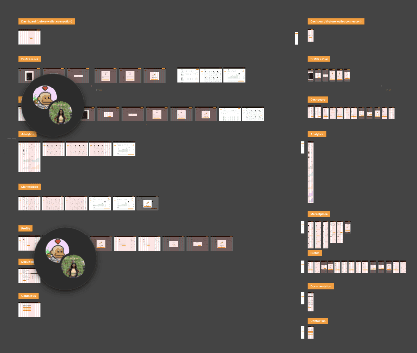
THE HARDEST PROBLEM — THE INVESTOR DASHBOARD
The investor dashboard was where the design problem was the worst.
The main problem was that investors needed enough information to feel in control and informed, but too much information would make them feel overwhelmed and hurt the trust we were trying to build.
My first version got the information architecture pretty close to right: portfolio overview, individual vehicle performance, repayment tracking, and KYC status. The order made sense.
But when I took a step back and looked at it again, I saw the problem: it looked like a basic dashboard.
That visual language was completely wrong for an investor whose main emotional barrier was distrust.
The version I made:
Put a single, clear portfolio health indicator at the top so that users could see the answer to "is this working for me" within three seconds of opening the app.
Moved granular charts below the fold so that they were only visible to people who wanted them.
Built-in visual progress indicators for each financed vehicle so that investors could see their money at work, not just numbers on a screen.
The change was from "Here is all the data" to "Here is what matters, in the order it matters."
"
I want to support drivers, but I don’t trust the current systems. I have no clear way to see where my money goes or if repayments are on track.
Oluwatobi Shokoya
"

The Outcome
1,000+ waitlist signups before public launch
2× Honorable Mentions at the Solana Global Hackathon
170+ screens shipped across mobile and desktop
Full brand identity and design system delivered
But the outcome I'm most proud of isn't a number.
It's that we took a product built on blockchain infrastructure — technology most of our users had never touched — and made it feel approachable, fair, and trustworthy. Not by hiding the complexity.
By designing it with enough care that the complexity stopped ffeeling like a barrier.

1000
1000
+
+
WAITLIST SIGN UPS
2
2
SOLANA RECOGNITION
Blockride taught me that trust is the first design problem in fintech, especially in markets where users have been let down by financial systems before. Everything else is not as important.
You need to build trust before you can make a dashboard. You need to plan safety before you plan an onboarding flow.
The research discovery that transformed my perspective was neither a usability finding nor a metric. An investor told me clearly that they wanted to help, but I had no way of knowing if they really would.
When we designed Blockride's investor experience, we had to answer that question with every screen, data point, and line of copy in the product.
That's how I look at every financial product I work on now.